
Infographics
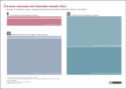
Nuclear warheads and fissionable material 2014
This information graphics shows the number of nuclear warheads in the world as well as the number of warheads that could potentially be equipped with the available fissile material.
More ...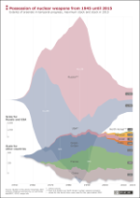
")
")
")